Role
Senior Product Design Consultant
Company
USA's Leading Telecom Company
Team Size
7
Duration
6 Months
Considering confidentiality with the company, I would not reveal the name of the product or any original details.
I was hired as a design consultant to create a marketplace where analytics, data, marketing, research teams can collaborate with deeply researched and visualised reports that benefit each other teams within the company. I have used my expertise in Data Analytics and BI, followed by Product Design to launch the marketplace in 3 months and later proceeded to build interactive analytics which displays and communicates consumer journey patterns to the users.
Later, I have designed a smart analytics bot that helps users to schedule reports either from the marketplace or simple metrics of their choice. You can read about it here.

BI & Business Analysts

Marketing Managers

Leadership
Marketplace has users from various teams with different personas, who are both technically strong and weak. It's a designer's responsibility to design the UI and its accessibility to accomodate these personas. Also, creating visually rich and interactive reports to provide insights on consumer patterns to the users and business leadership.
Multi platform adaptive UI
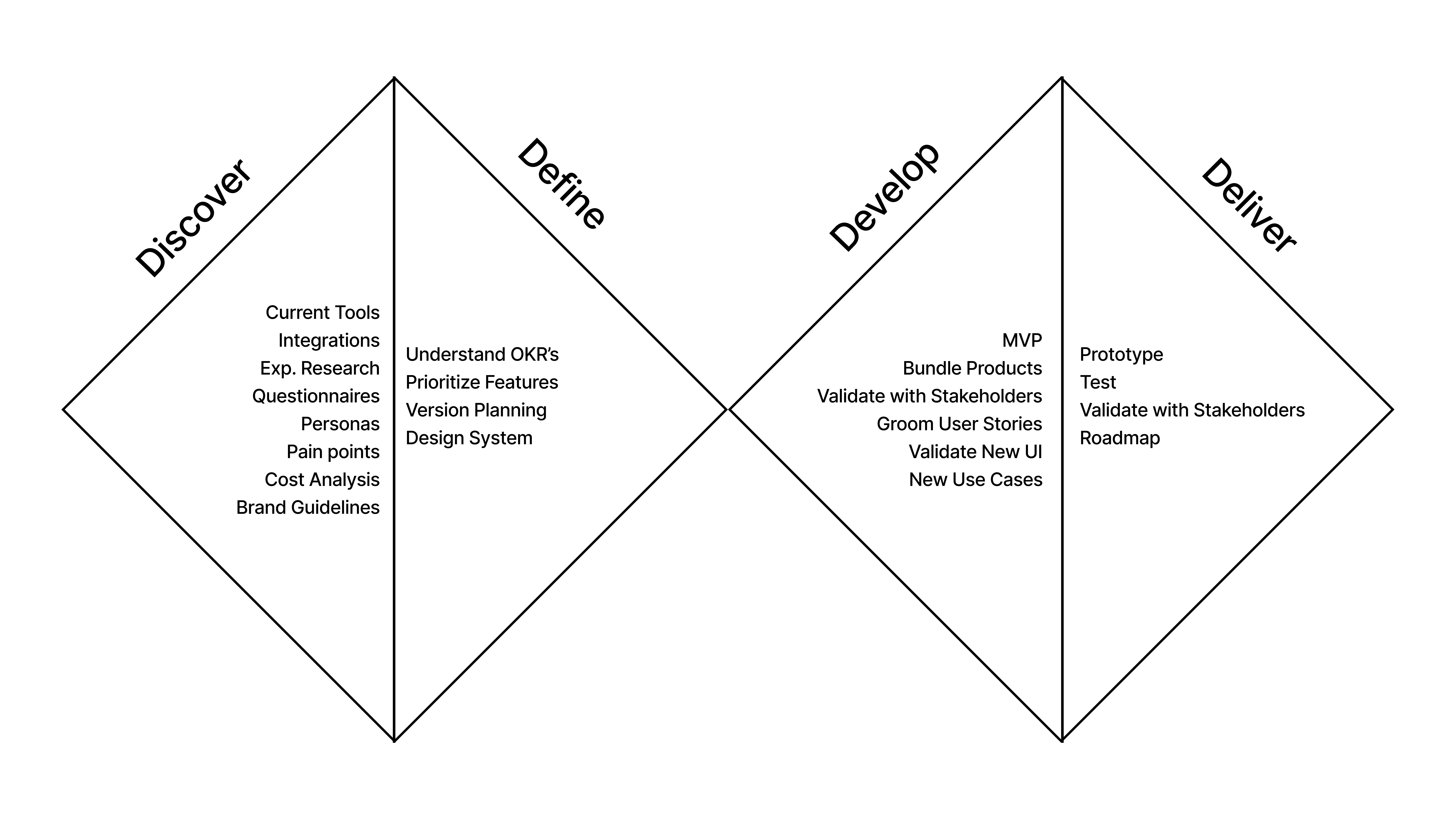
I have started discovery by performing research and contextual inquiries with BI and Data Science team. In my research i have tried to uncover why is it important to have a holistic collaboration between teams for reports in the company and why is important for the business.What are the tools the teams have been using if not for this marketplace. I have discovered that most of the teams are using tools listed below to create and share reports internally.
Later i proceeded to analyse the type of reports and listing and tried to get answers for the following questions.
With multiple teams being involved for the benefit of the project, it was a mammoth of a task to convince the stakeholders why it is very important to keep the design simple. As there are personas who needs to access the dashboard without any analytics experience.
After performing this discovery, i have also taken references of any internal dashboards different stakeholders under a leadership has been following.
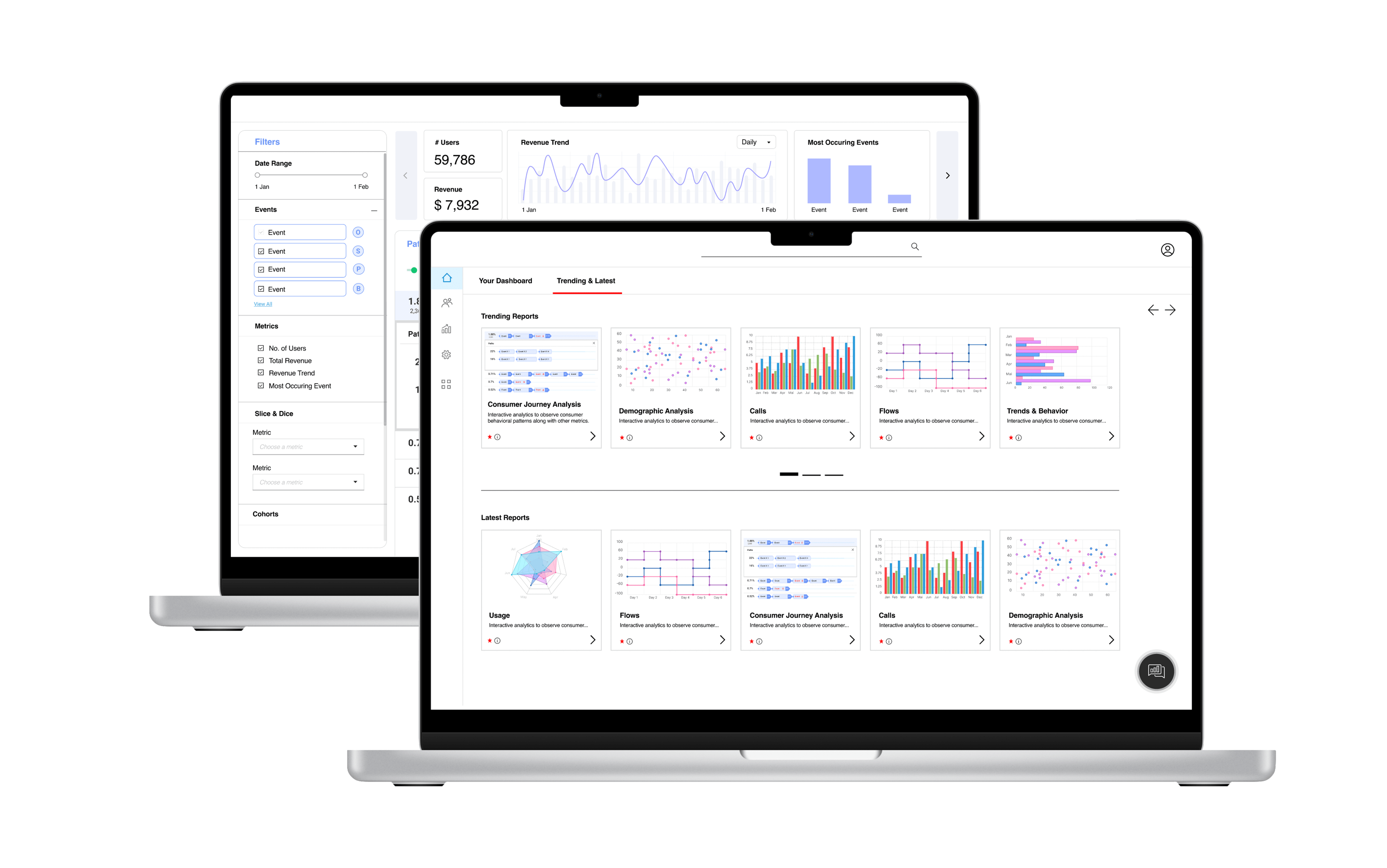
Later as we moved to design, i had categorised the reports while providing universal access to all the reports from home page. I have designed an intuitive UI, that integrates reports from any tool and capability to view upto 6 reports in different tabs. Users can create their own folders, save and access public reports. Users can also request access to reports they are interested in or request for customisation. Any deals that needs to be made, will be initiated through the help section of individual report.
Innovative Visualizations
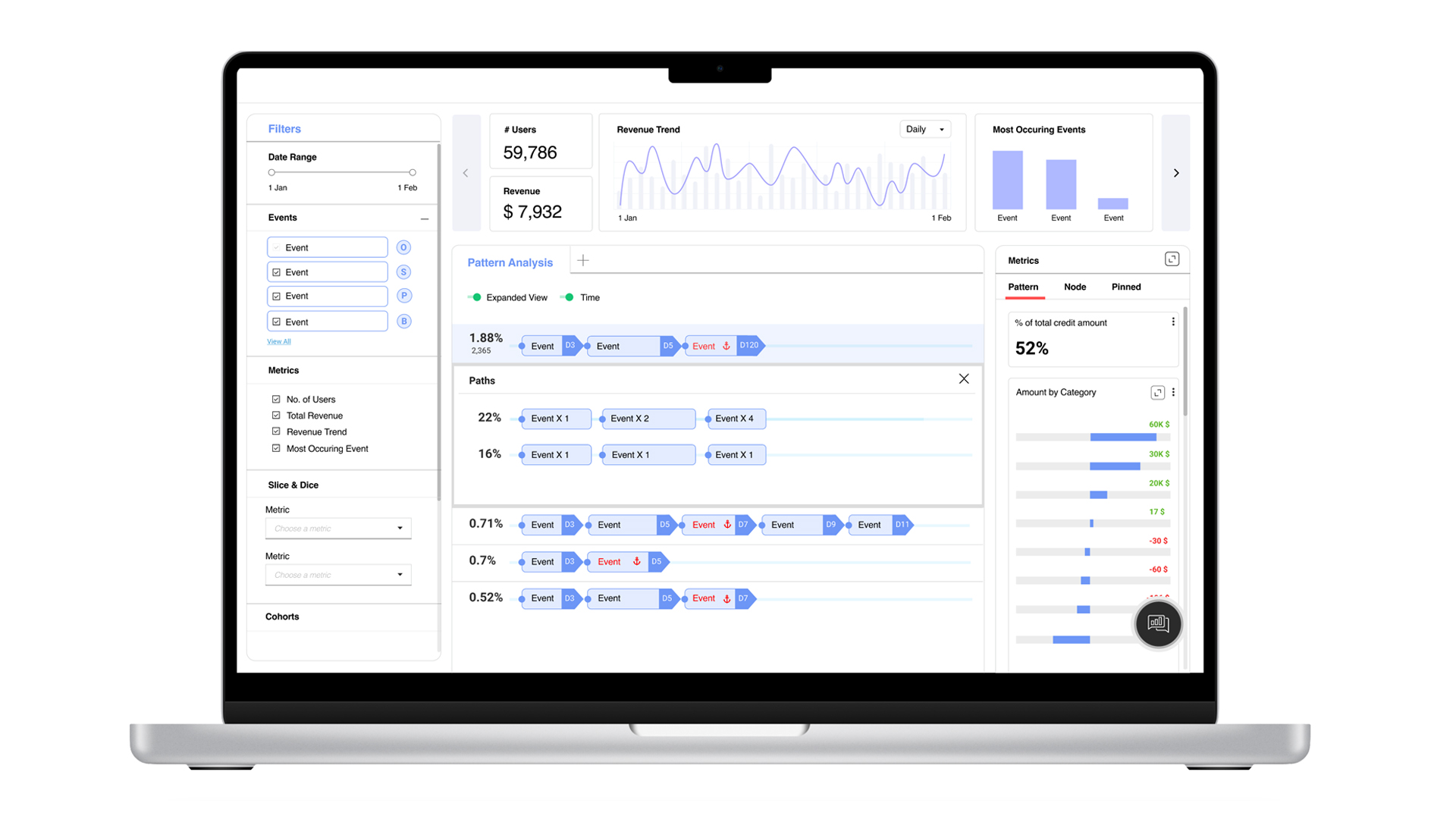
In addition to designing UI, i have also created many interactive visualizations to include in public reports for users to access. I've gone out-of-the-box to create infographics that help users to drill down detailed information at every step. One of them is Consumer Journey analytics, which displays patterns of consumer through different channels. Business Leadership has requested to include consumer journey analysis and patterns in the marketplace, which would be a potential opportunity for various use cases.With the data on reports that i have compiled in the discovery phase, i have listed down consumer reports that are observed by all teams, few teams. The research also included, what are the metrics and what are the different stages each team is observing. I have also registered to and experiemented on various other products in the market which are trying to achieve the same. With this data i have planned to integrate various visualtions to one interactive visualization.
I have created a very own design which first shows the user patterns over period, with respect to one anchor event. User can at any time click on any event/node to see detailed patterns and metrics related to that single node on the right side. Users can also drill down by opening a sankey chart of that node in a new tab and drill through the user flow across different events.